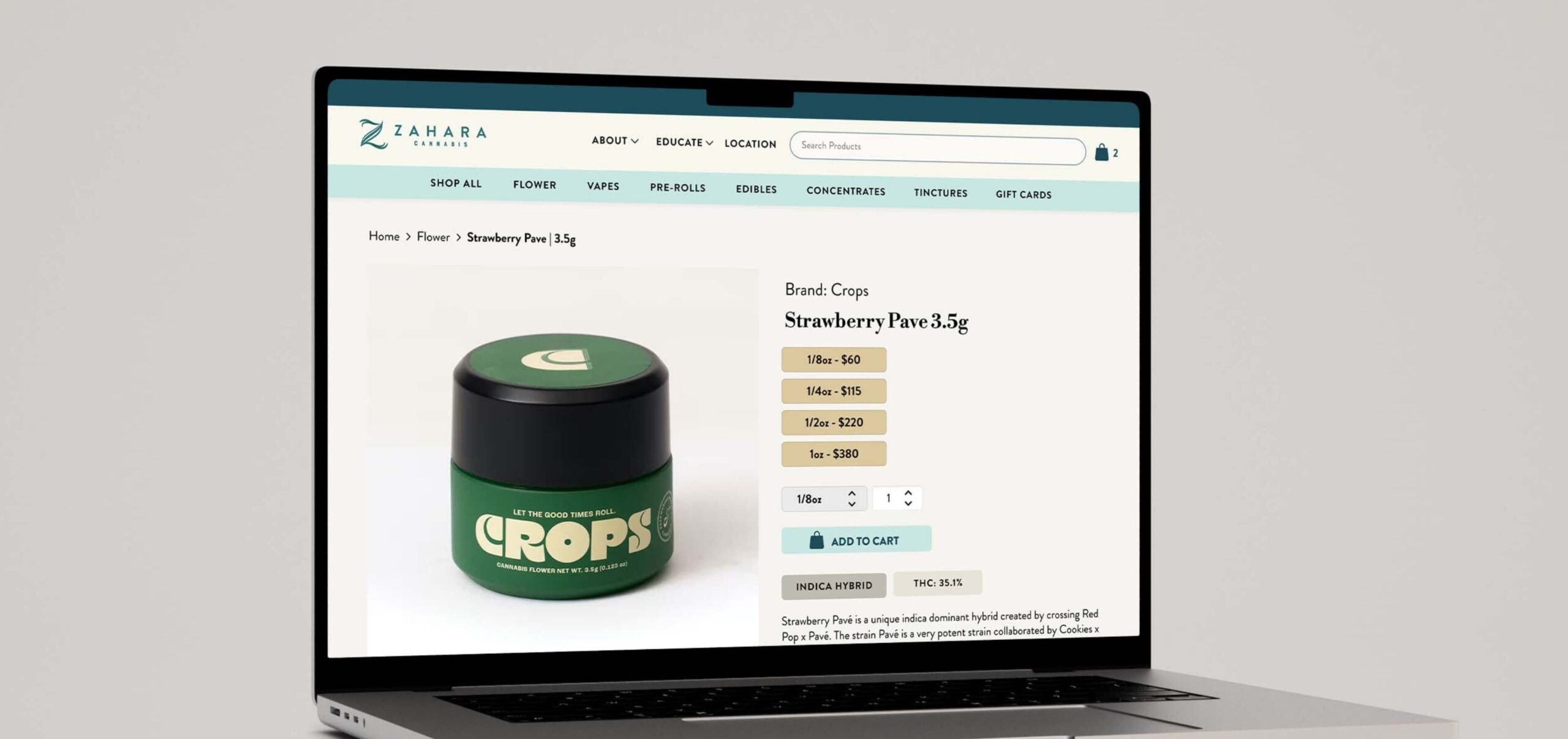
OUTCOME
Conversion rate, increased from 15%
Increase in monthly
revenue
Drop-off rate, decreased from 12%
WHAT I DID
Led UI/UX strategy and design, assisted with front-end development, conducted user research and led stakeholder meetings.
PLATFORM
Web & Mobile
TIMEFRAME
Completed in 4 weeks (2024)

WHO IS THE CLIENT?
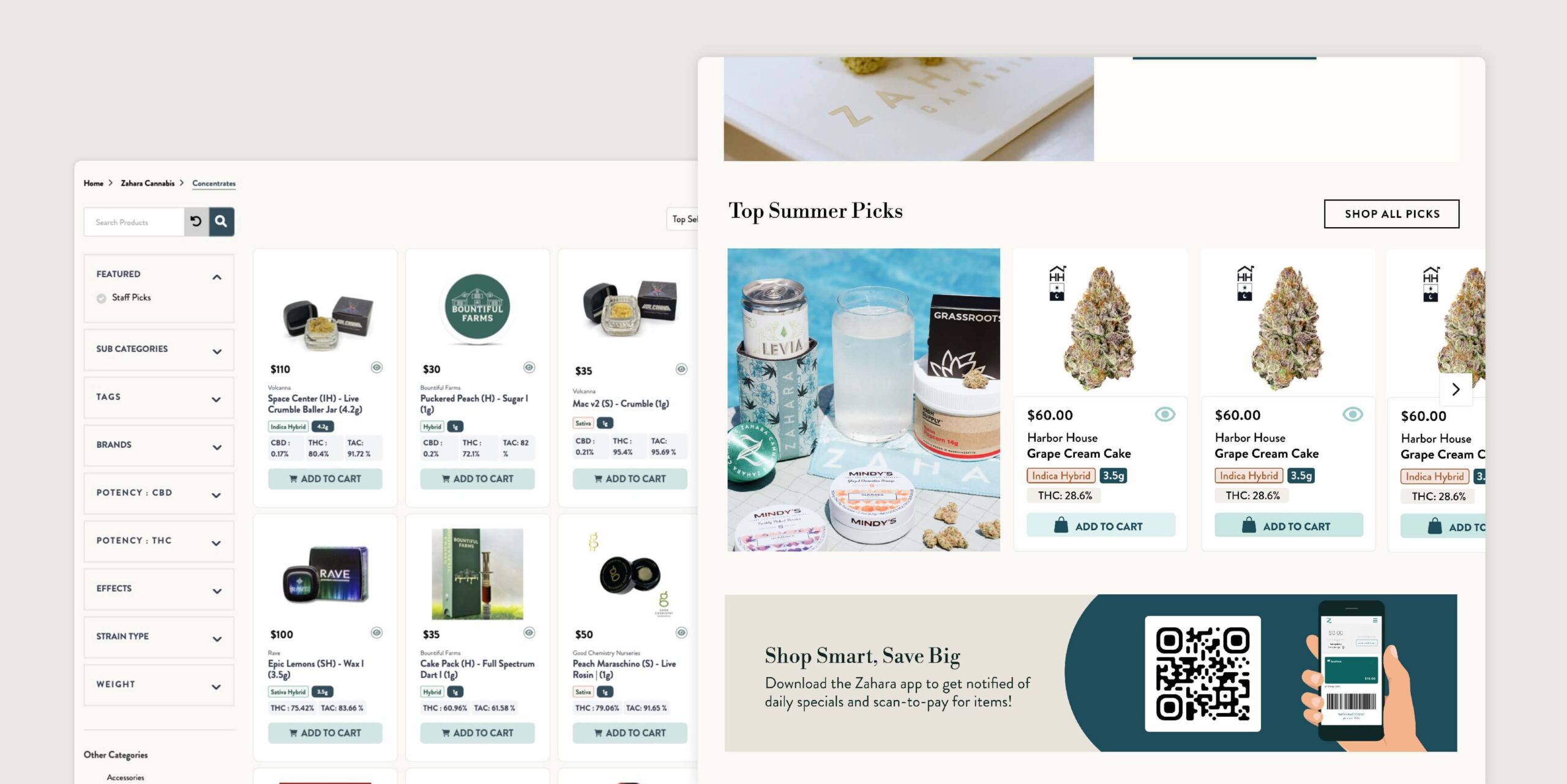
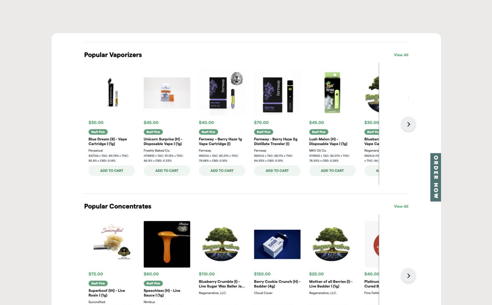
Zahara Cannabis, a Massachusetts-based dispensary, used a Dutchie iFrame for their e-commerce platform, which limited functionality and negatively impacted the user experience, especially for mobile users. This setup resulted in lengthy scrolling and missing e-commerce items crucial to the shopping experience.
THE PROBLEM
OBJECTIVES
— Identify and address root causes of low conversions through user research.
— Introduce e-commerce features that are familiar to the typical online shopping experience.
— Ensure the platform complies with all regulatory requirements for security and legality.
— Optimize the site for search engines to attract organic traffic, given the marketing restrictions for cannabis.
THE CHALLENGE
Zahara’s iFrame limited access to essential user analytics, hindering insights into customer buying behaviors, popular search items, and checkout issues. Consequently, reasons for cart abandonment are unclear, and customer insights heavily rely on in-store interactions.
Additionally, due to a tight one-month timeframe and budget constraints, some corners had to be cut.
THE APPROACH
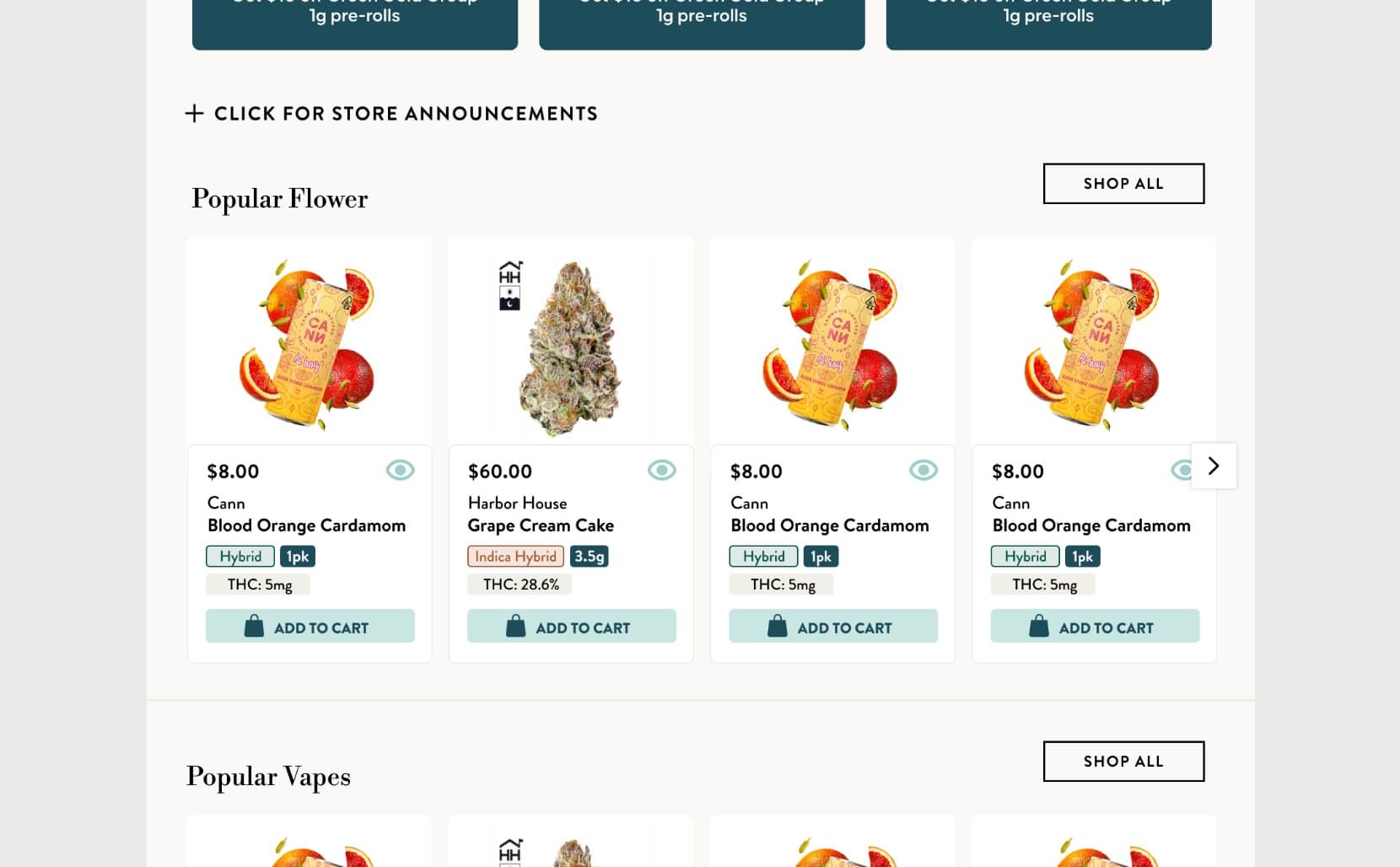
Developing a custom e-commerce platform would enable optimized SEO to attract new users, addressing the marketing restrictions on cannabis, as well as optimize the shopping experience for users.
To ensure the new website complied with regulations, I partnered early on with a team of experienced developers knowledgeable in industry standards.
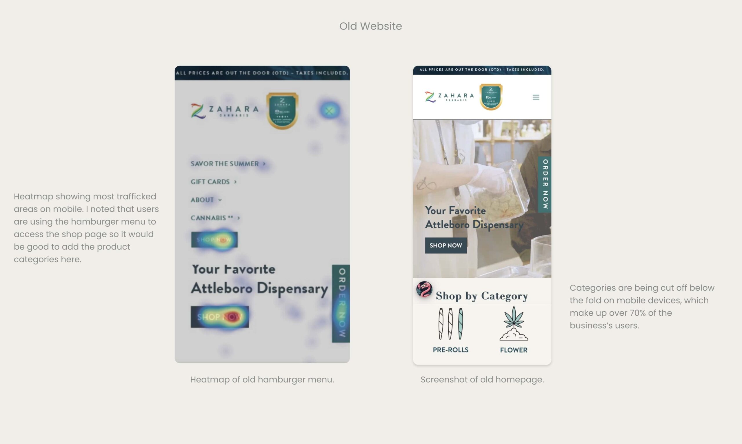
Given limited user analytics and budget constraints, I had to conduct a week-long heatmap study on the current site to uncover hidden issues.
THE FINDINGS
QUANTITATIVE RESEARCH
• A heat map revealed less than 40% of users scrolled past the homepage header
• An average user spent over 9 minutes on the site, suggesting a need to streamline the shopping and checkout experience to lessen the time spent
• Over 70% of users use mobile devices, yet the site is not optimized for mobile with lengthy scrolling
• 12.6% drop-off rate, hinting at user frustrations
• Flower accounts for 55% of e-commerce sales
USER NEEDS [SECONDARY RESEARCH]
• Find the best deals on products quickly
• Easily find products by category with user-friendly navigation
• Quickly search for specific items
• Filter options by strain type
• Access educational info on strains, usage, and laws
• See customer reviews on dispensary
• Get info on THC/CBD content, ingredients, and effects
SITE ANALYSIS
At this stage, it was crucial to examine real analytics to identify user frustrations that a preliminary site audit might have missed.
PROTOTYPING
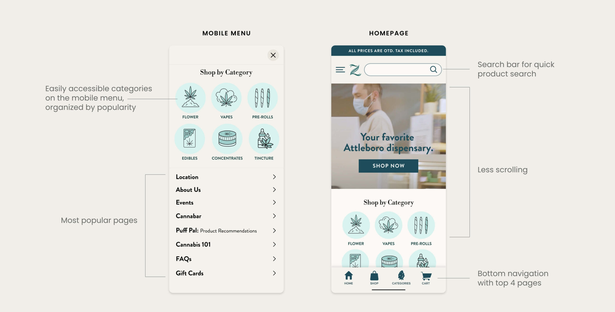
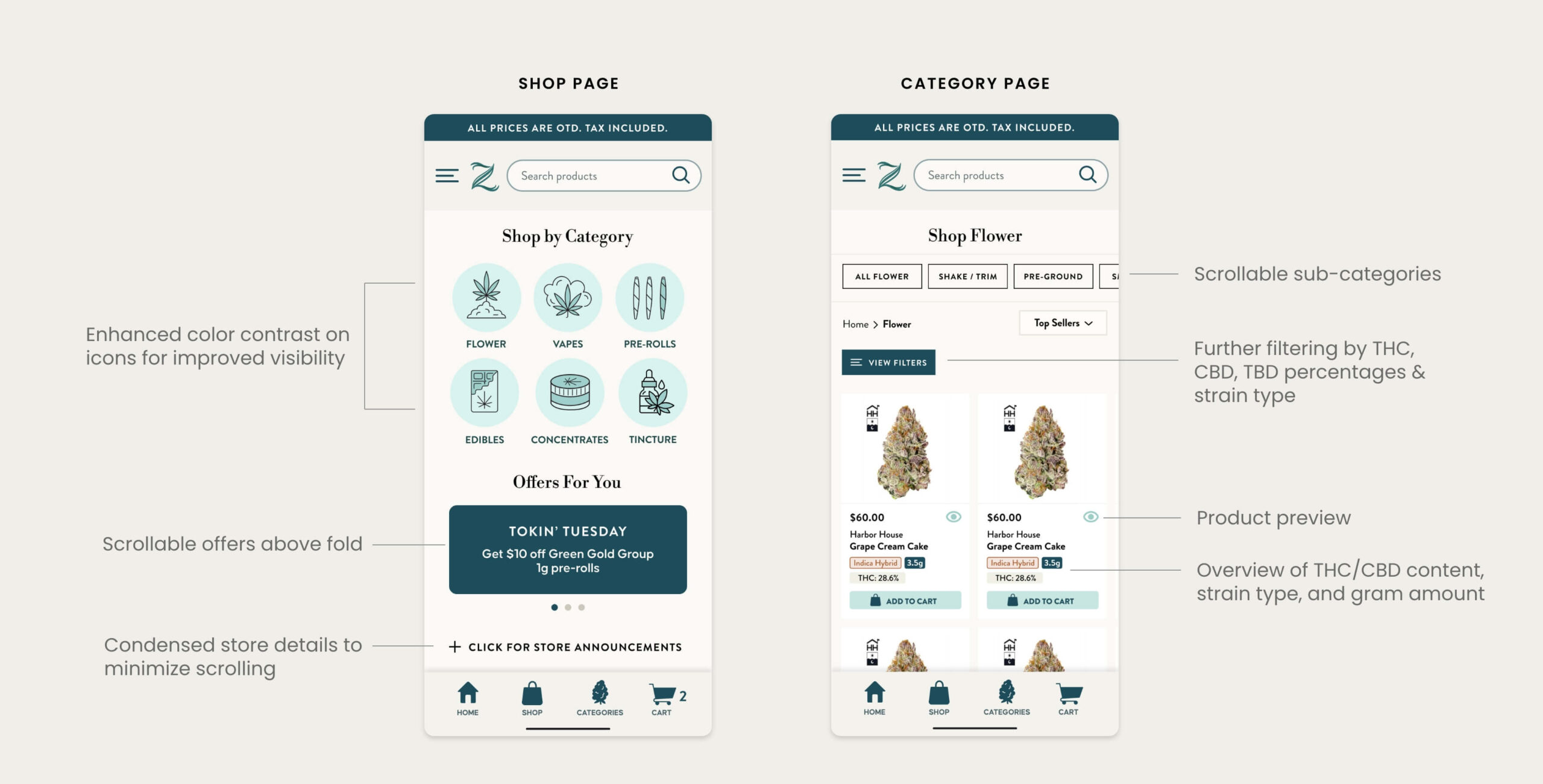
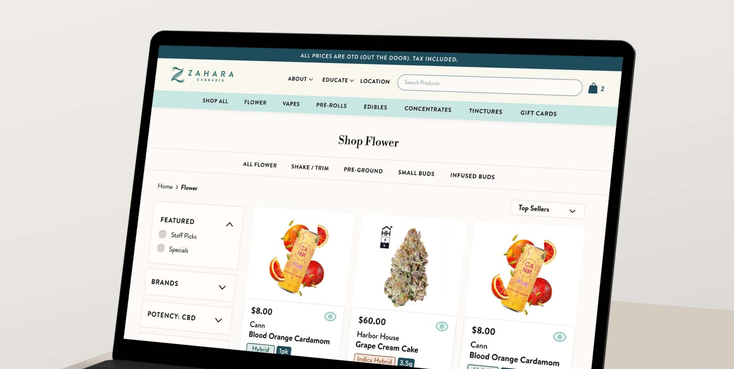
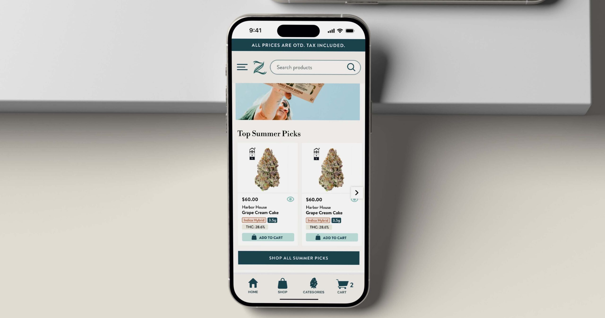
After uncovering user frustrations, I moved to wireframing and prototyping the proposed solution. Given that mobile users account for around 70% of visitors, I adopted a mobile-first design approach to ensure the website was optimized for mobile devices.
DESIGN RATIONALE
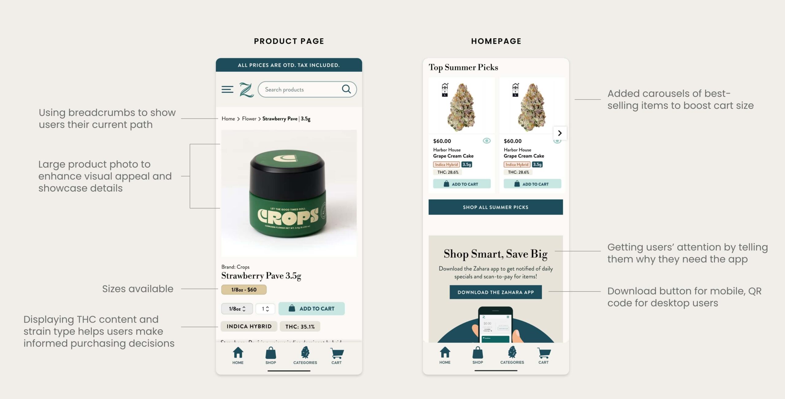
At this stage, I presented the wireframes and working prototype to key stakeholders, detailing the reasoning behind each design choice and how they enhance the overall user experience.
OUTCOME
The website redesign significantly improved user experience and engagement. The drop-off rate of frustrated users decreased from 12% to 5%, and the average user now navigated through 10 pages. Previously, only 40% of users scrolled past the homepage, but now 80% do, leading to increased interaction with the best-selling product carousels.
This boost in engagement has resulted in larger cart sizes and higher conversion rates, aligning with the business’s goals. As a result, the overall conversion rate jumped to an impressive 28%, with 21% of users returning as repeat customers. In the first month after the redesign launch, monthly sales surged by $45,000.
WHAT DID I LEARN?
I learned that adapting the UX process to fit technical constraints and focusing only on what’s needed for each project helps ensure efficiency and effectiveness. It’s often impractical to follow every UX step due to developer hand-off and tight client deadlines.
Ultimately, prioritizing the most impactful elements leads to better outcomes and aligns with real-world project demands.