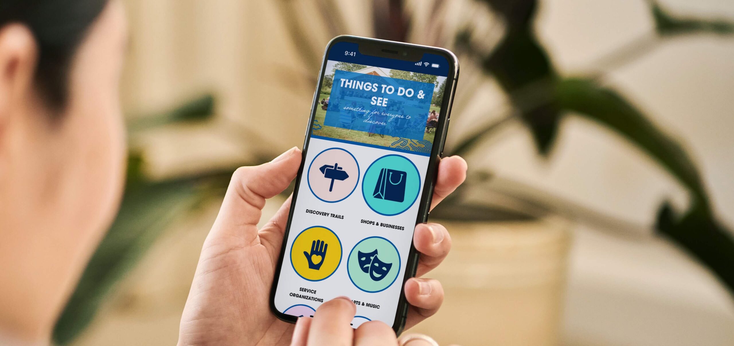
OUTCOME
Increase in web traffic
User satisfaction rating in post-launch survey
Increase in social media shares of district events
WHAT I DID
Led UI/UX strategy and design, developed the website, and presented my research, wireframes, and insights to a board of committee members.
PLATFORM
Web & Mobile
TIMEFRAME
1 month (2024)
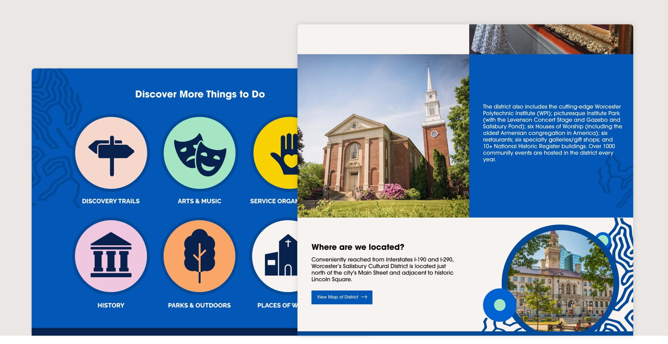

WHO IS THE CLIENT?
Worcester’s Salisbury Cultural District (WSCD) in Massachusetts is renowned for its rich history, cultural institutions, and stunning architecture. Guided by a board of committee members, the district frequently hosts events that attract visitors from across the region.
THE PROBLEM
BUSINESS PROBLEM
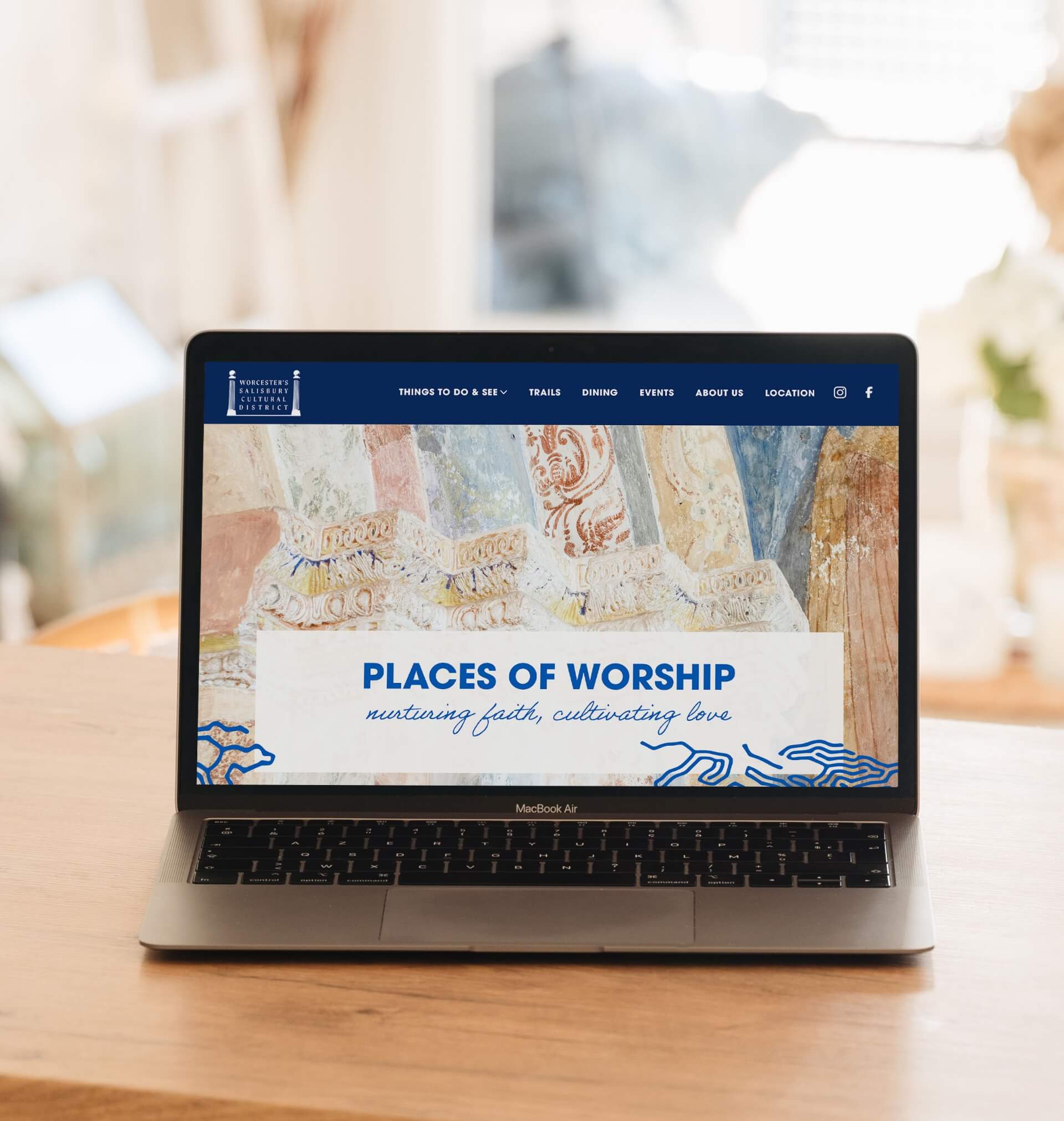
The website needed an update to better attract visitors and families. The old site didn’t show off the district’s lively atmosphere or its many attractions, missing chances to highlight what it has to offer.
The goal was to create a modern, easy-to-use site that would excite visitors and boost both foot traffic and event participation.

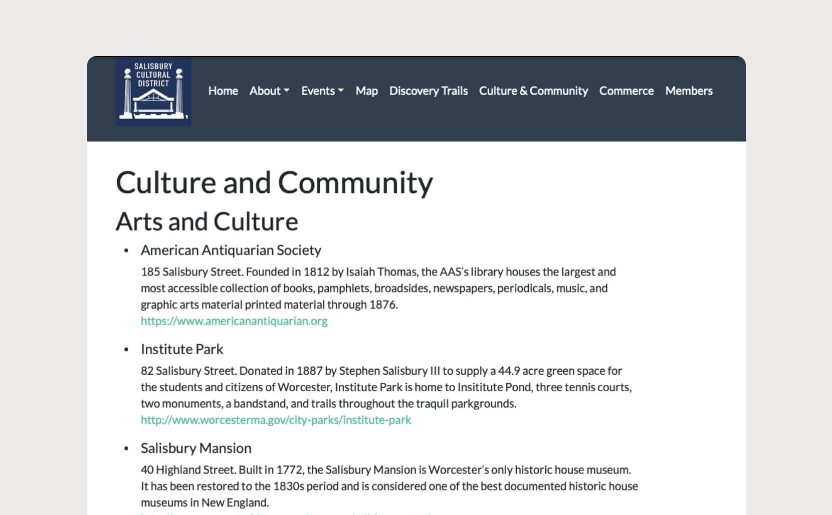
USER PROBLEM
— Confusing Navigation: Users find it hard to navigate the current site, making it difficult to find activities and attractions in the district.
— Overwhelming Copy: The website has too much text without enough visual breaks, which makes it hard for users to read and find information.
— Lack of Visual Appeal: The site is too plain and lacks color, failing to reflect the vibrant and lively nature of the district.
RECOMMENDATIONS
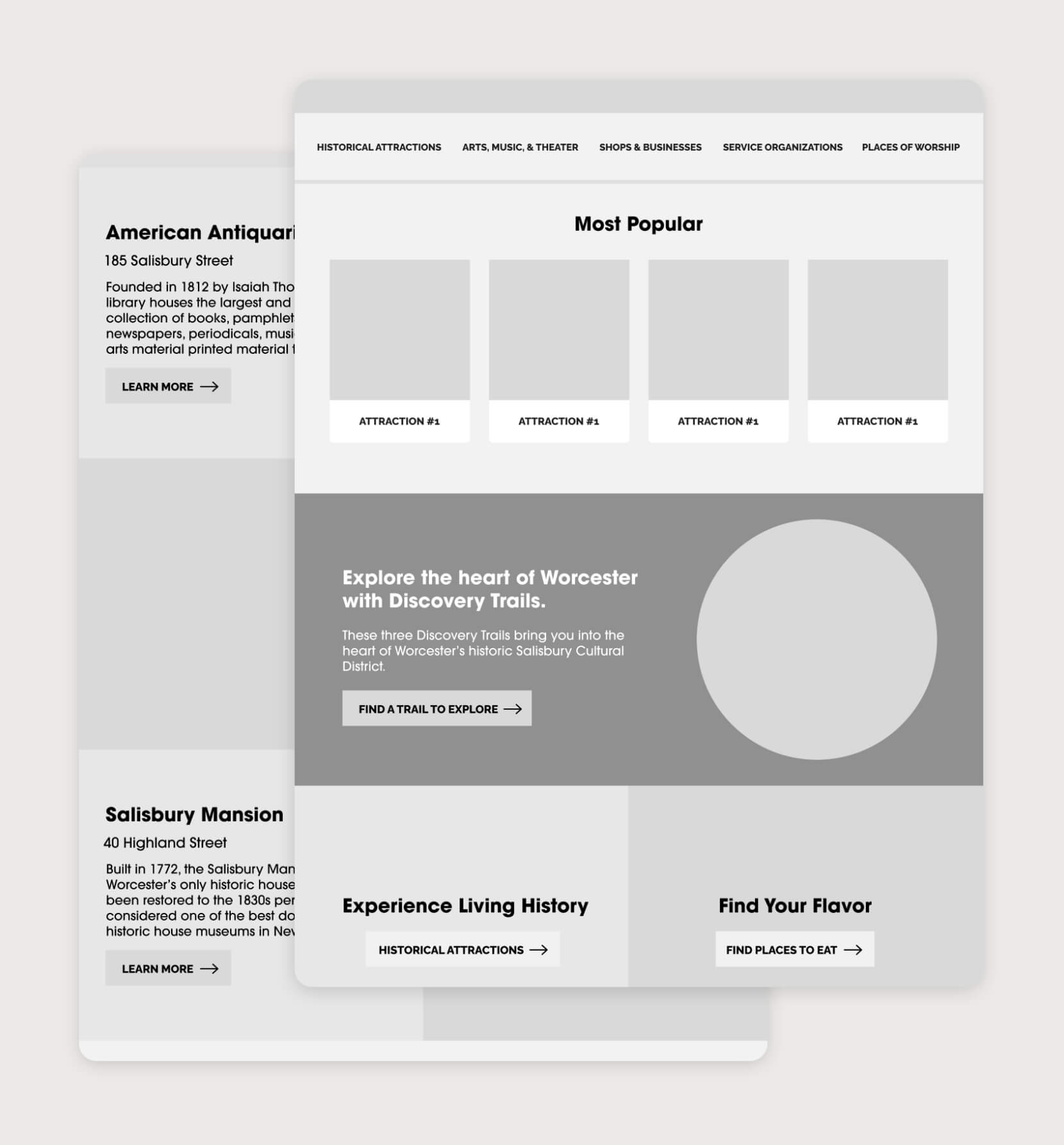
— Update Sitemap: Simplify the navigation terms so the user can quickly glance and find what they’re looking for. i.e. “Commerce” = “Shops & Businesses”.
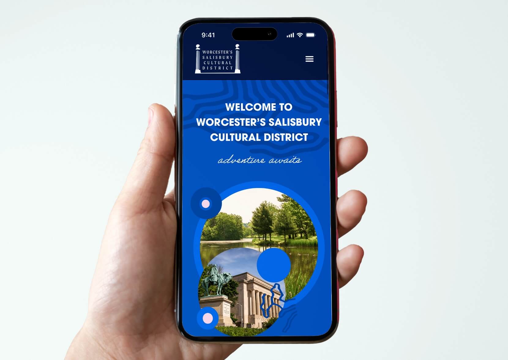
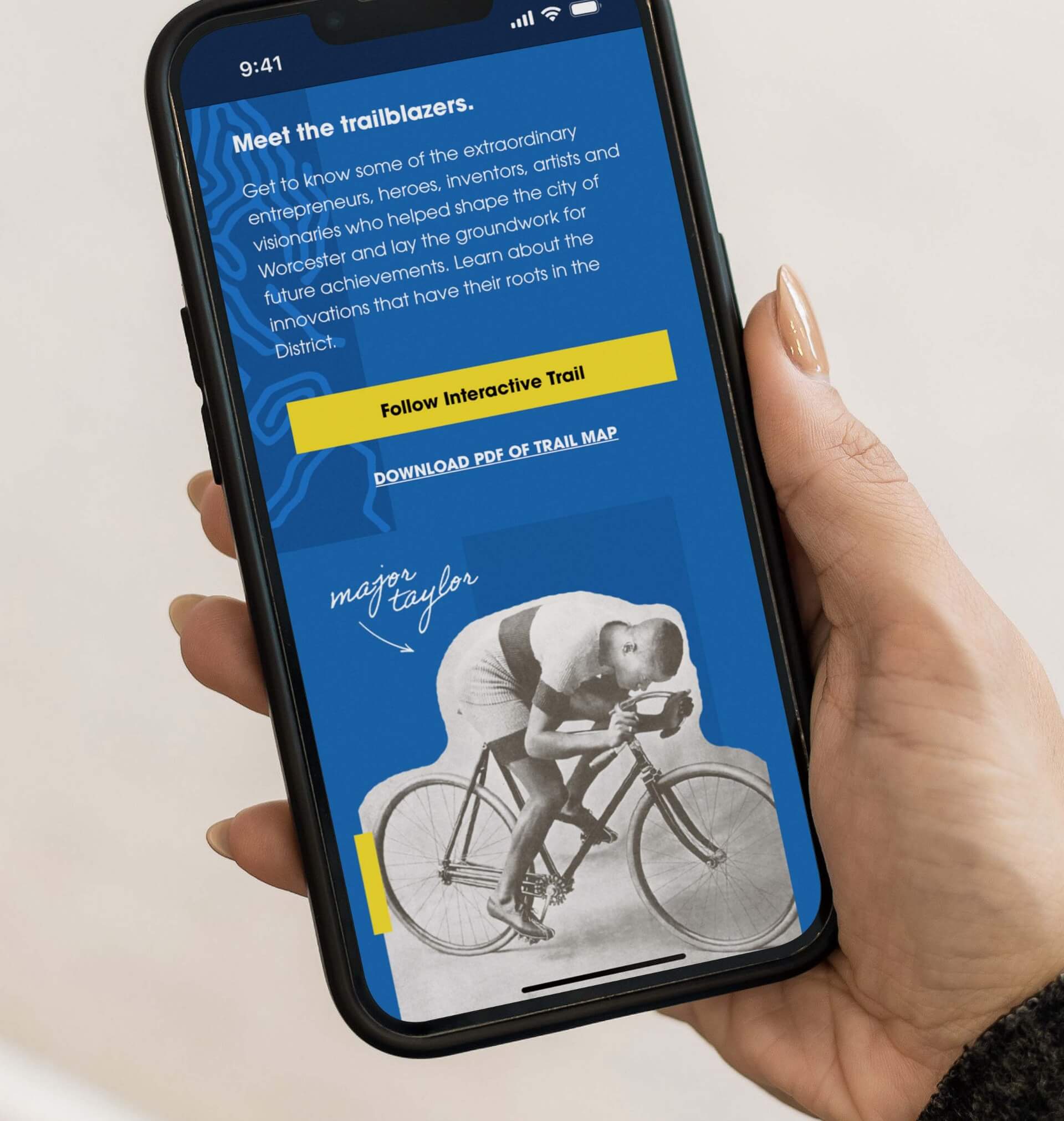
— Reduce Cognitive Load: Simplify text and pair copy-heavy sections with striking visuals and color.
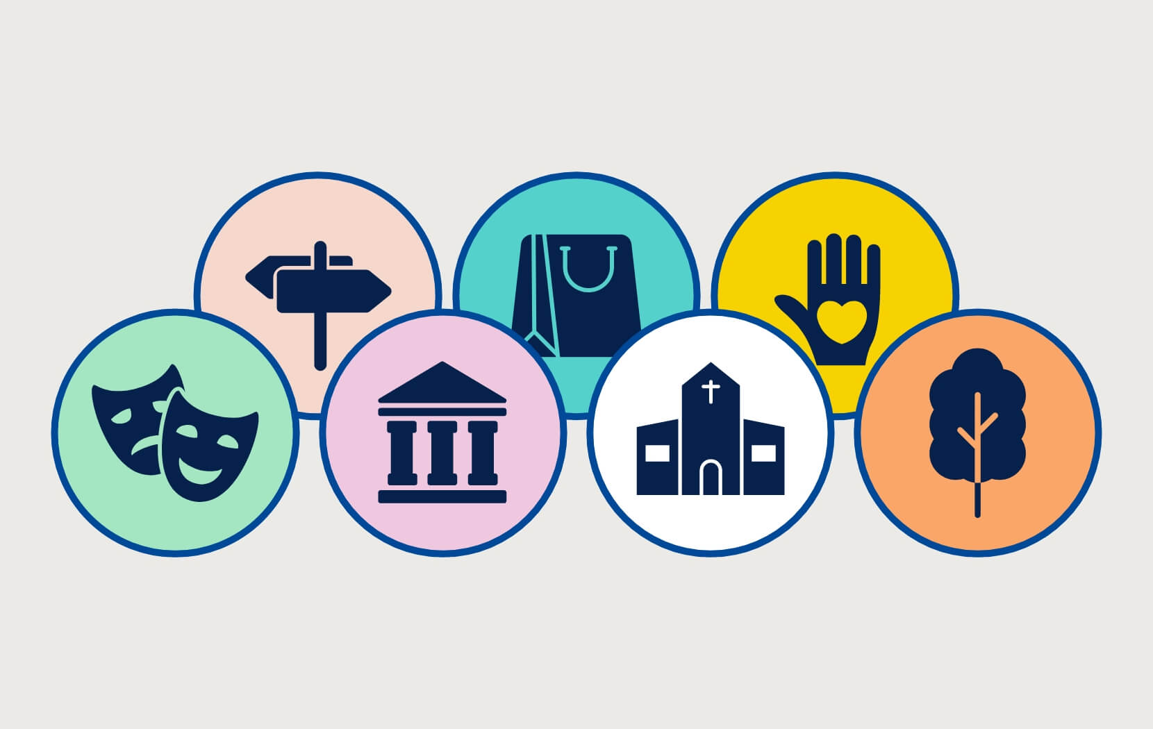
— Color-coded Icons: Create an icon for each attraction in the district to allow for faster decision-making and to integrate the new brand identity into the site.
— Enhance Accessibility: Increase text size and enhance visual contrast to better accommodate older users and those with vision impairments.
IMPLEMENTATION
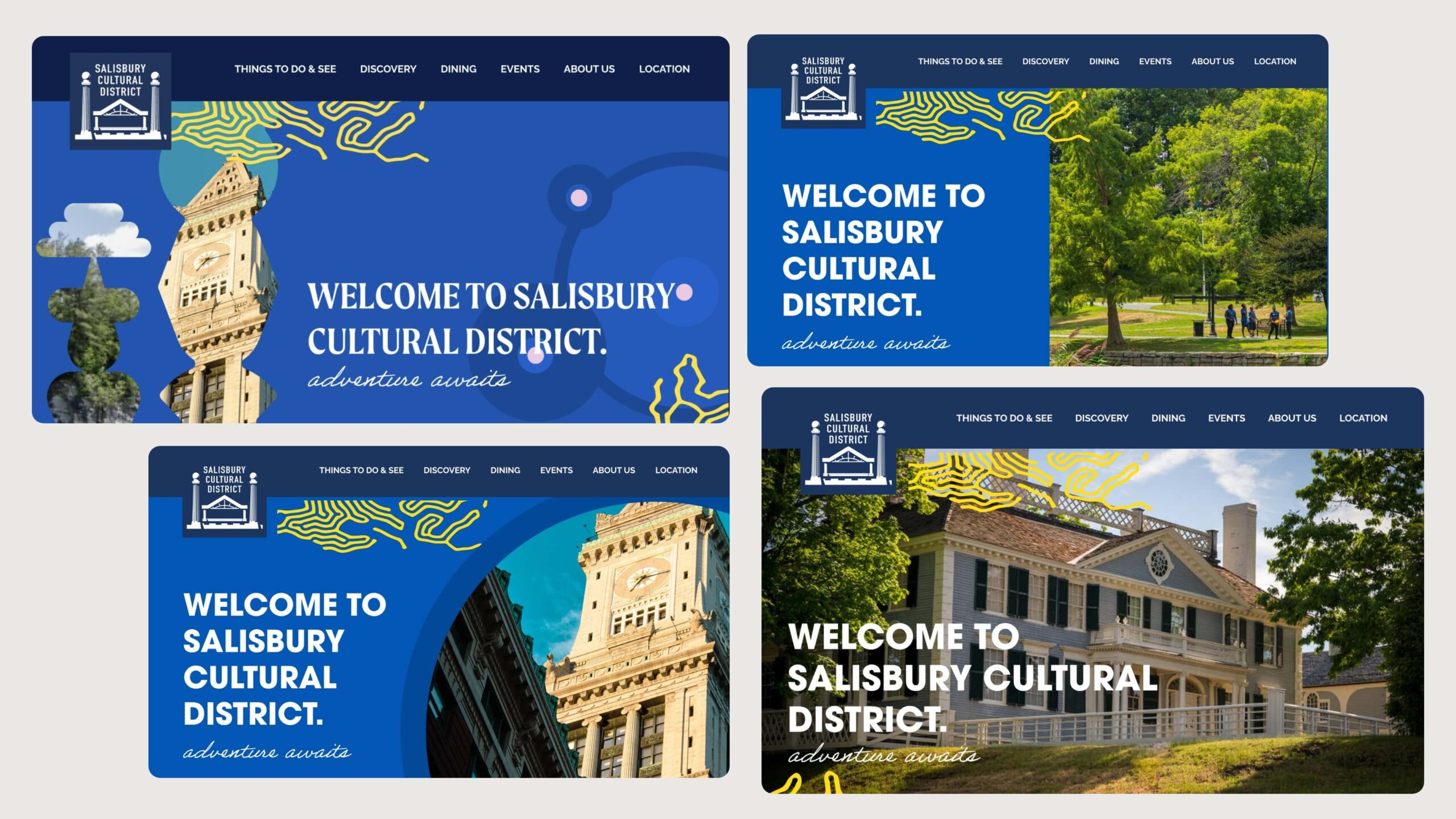
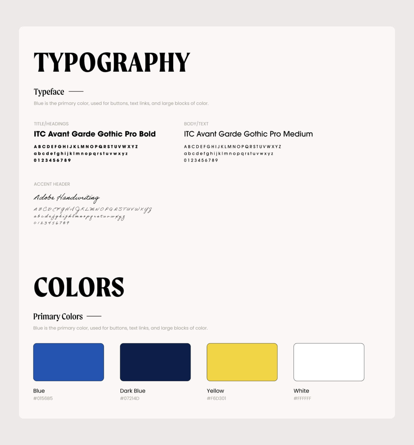
I experimented with different header layouts and font pairings. After discussing with the client, we chose a bold sans-serif font for its readability and to appeal to the youthful, family-oriented demographic of the district’s target audience.
After presenting the initial layouts to users, we noticed significant confusion caused by some of the shapes in version 1 below. We opted to simplify the design by incorporating more circles and changing the yellow lines to dark blue, as the previous lines had reminded users of geographical maps.
CONSTRAINTS
OUTCOME
With the August 1st launch deadline rapidly approaching, I had to develop the site in just two days to give stakeholders enough time for approval, edits, and troubleshooting front-end bugs.
Despite the tight schedule, the deadline was successfully met, and the committee was thrilled with the final result. The website experienced a 45% increase in traffic and a noticeable boost in user engagement. Social media shares jumped by 80% as users found it easier to access and share content from the social icons and events page. Due to enhanced SEO, new users were discovering the site and actively sharing district news.
WHAT DID I LEARN?
In the fast-paced agency world, turnover times are quick! As a designer also taking on development responsibilities for this project, I ensured my prototype was practical for straightforward implementation.
From this project, I learned the importance of balancing design creativity with technical feasibility and the value of clear communication and planning to meet tight deadlines effectively.