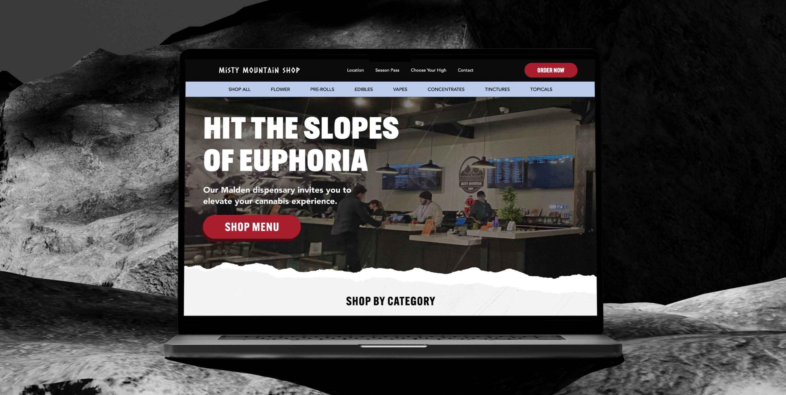
OUTCOME
Increased conversion rate
Increase in mobile user engagement
Increase in monthly sales
WHAT I DID
Led UI/UX strategy and design, conducted user research on target demographic, created prototypes, and developed the website.
PLATFORM
Web & Mobile
TIMEFRAME
1 month (2024)
WHO IS THE CLIENT?
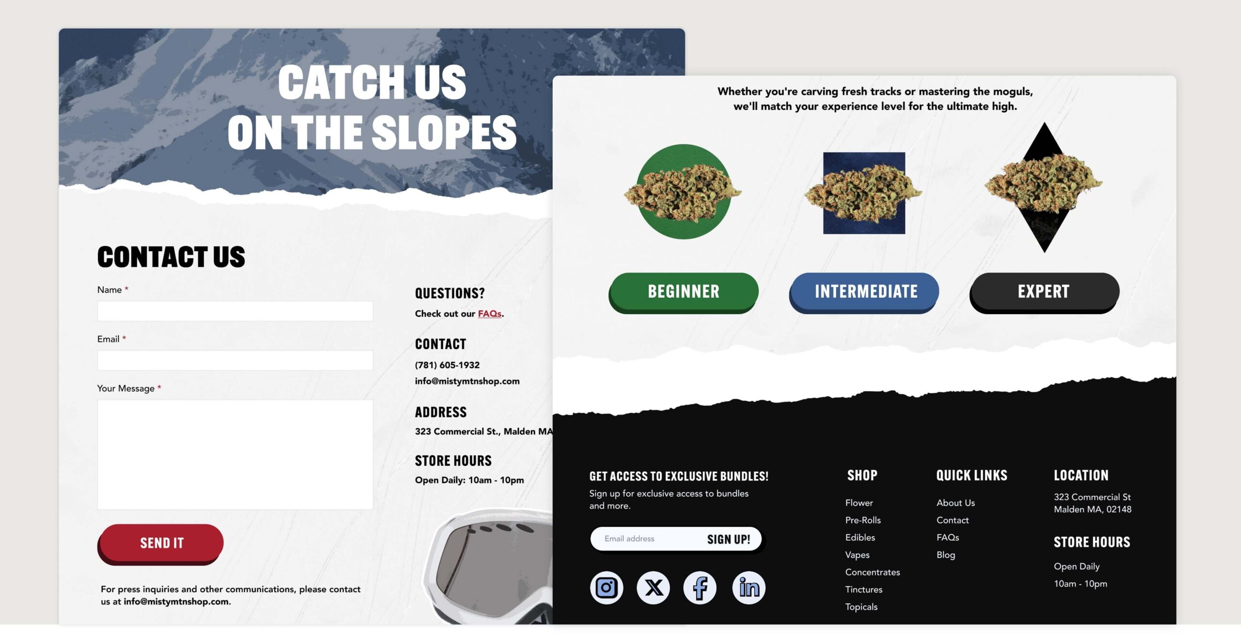
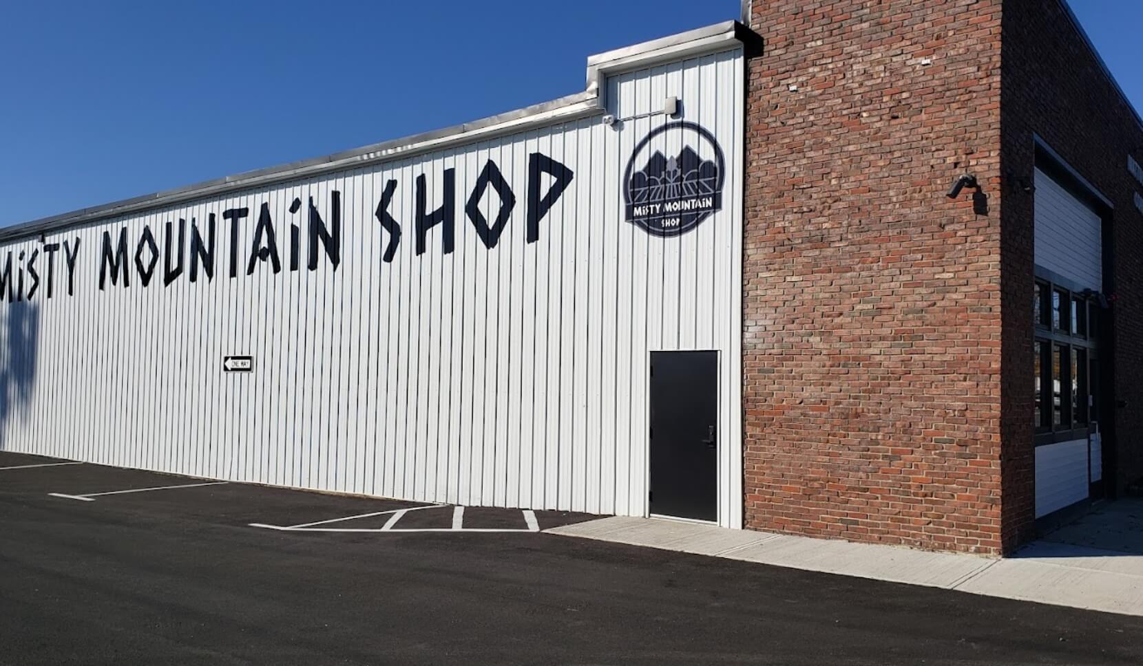
Misty Mountain Shop Cannabis is a ski-themed dispensary in Malden, MA that offers a variety of cannabis products like flowers, edibles, and concentrates. The brand captures the feel of mountain landscapes and skiing, attracting people who love nature and outdoor fun.
THE PROBLEM
BUSINESS PROBLEM
The business faced low conversion rates, email sign-ups, and customer dissatisfaction with the mobile ordering experience on their website. They needed to enhance the site’s performance while leveraging their unique ski-themed branding to differentiate themselves in the market.
USER PROBLEMS
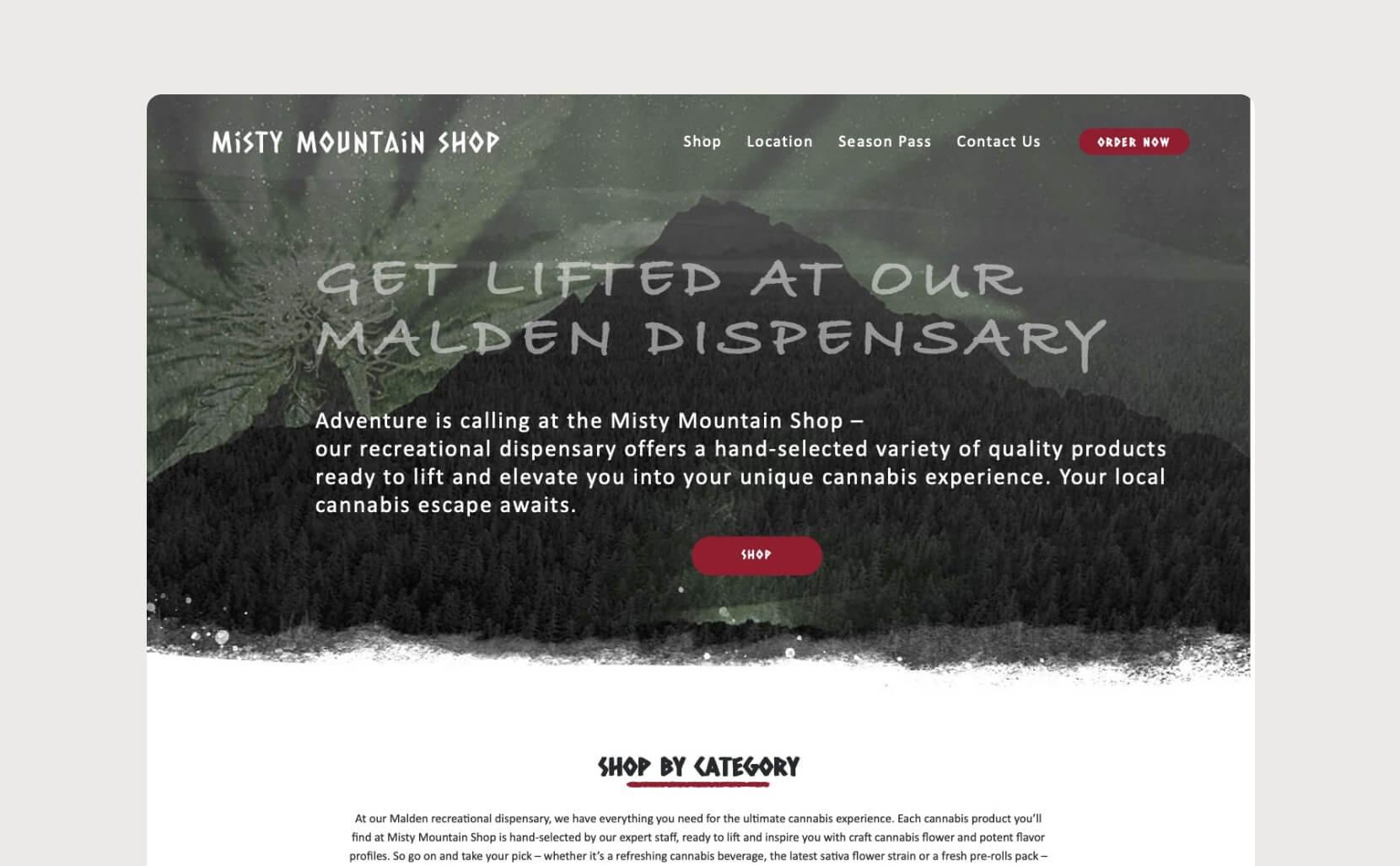
— The site isn’t optimized for mobile, which is critical since 83% of users access it on mobile devices.
— The site lacks visual appeal, with inconsistent header sizes and unreadable fonts. A more aesthetically pleasing design could enhance the user experience.
— The site is too copy-heavy; users want a faster shopping experience, so it needs to be optimized for e-commerce.
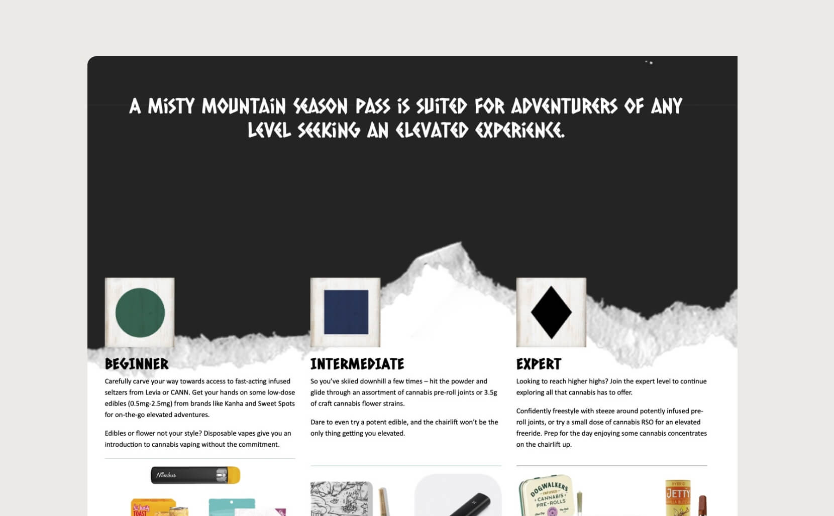
— The site is missing an FAQ section, which is essential for guiding inexperienced cannabis users, the secondary target audience.
— Important information like store hours is missing from the site.
TECHNICAL CONSTRAINTS
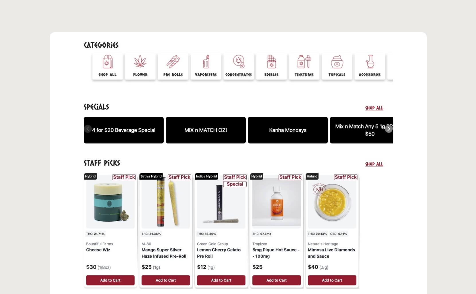
The e-commerce section of the site was embedded in an iframe to comply with legal cannabis requirements, which made integrating essential features like a search bar, cart icon, and carousels difficult. As a result, I had to work around the iFrame and find a way to seamlessly blend it with the rest of the site, since I couldn’t modify the iframe’s design.
USER RESEARCH
Due to budget constraints, I installed a heat map on the site and analyzed user interactions. It became clear that most users were overlooking the grid of categories below the header, likely because the squares did not appear clickable and were too large for mobile users to navigate easily.
On mobile, only 30% of users scrolled past the header, and a significant number tried to click on the FAQ categories at the bottom, only to find that the selection levels were not clickable. With these issues in mind, I developed a list of recommendations to minimize user frustrations and improve conversion rates.
RECOMMENDATIONS
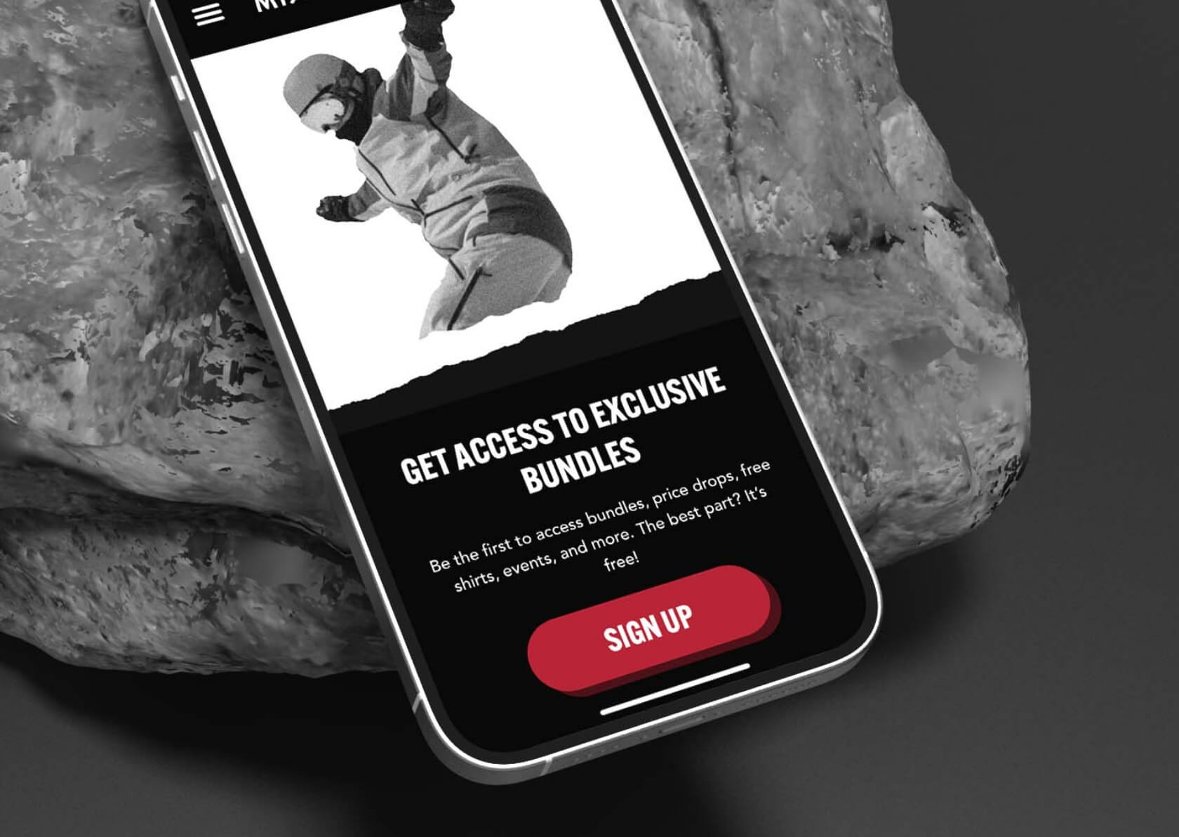
— Add a “Shop Now” button to the hero section with a concise value proposition.
— Include the categories above the fold for easy access, limiting to 6 options to avoid overwhelming users with choice and ensure even rows on mobile.
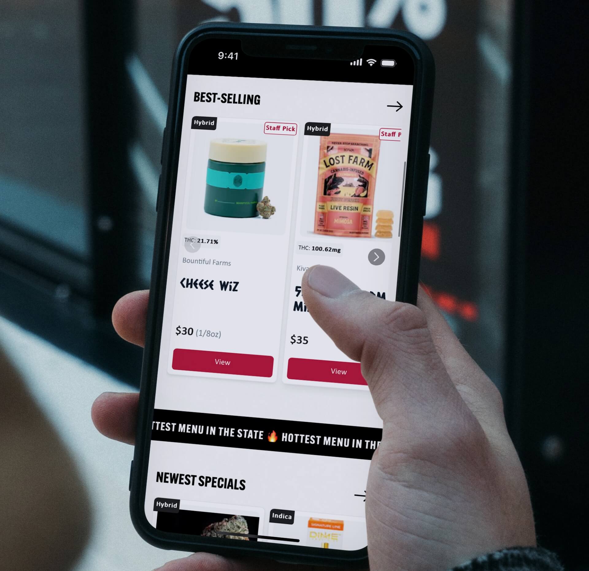
— Implement product carousels on the homepage to drive sales.
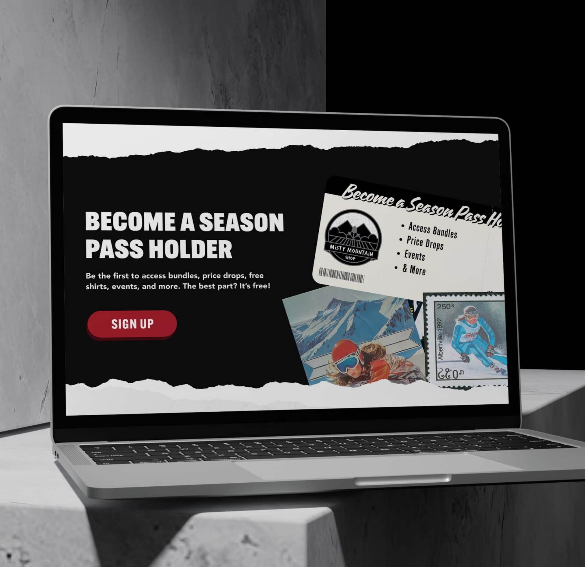
— Highlight the dispensary’s loyalty program, as it’s the primary method for advertising deals.
— Revamp the FAQ section to attract new cannabis users, providing a guide tailored to different experience levels.
— Minimize text where possible to facilitate easy scanning and reduce scrolling for mobile users.
Prototype of mobile menu with categories added.

OUTCOME
After implementing the proposed updates, monthly sales increased by $35k. Additionally, 80% of users scrolled past the header, prompting users to interact with the product carousels on the homepage, which led to a higher average cart size.
Conversion rates rose by 33%, and the bounce rate for users who only visited the homepage decreased significantly from 58% to 15%. Overall, the established KPIs were successfully achieved, and users experienced fewer issues when ordering on mobile.
WHAT DID I LEARN?
Understanding how users interact with different elements on a site is crucial for making effective design improvements. For example, analyzing heat maps and user interactions helped identify which features were most and least engaging for this project.
Ensuring that a site functions well on mobile devices requires careful planning, especially when dealing with constraints like theme limitations and iframe integrations.